Map Walk-through
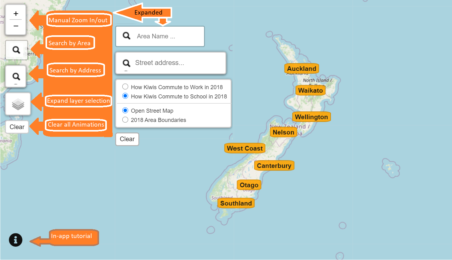
Switch among different map layers, datasets, or search for area name or street address using the various widgets on the top-left panel.
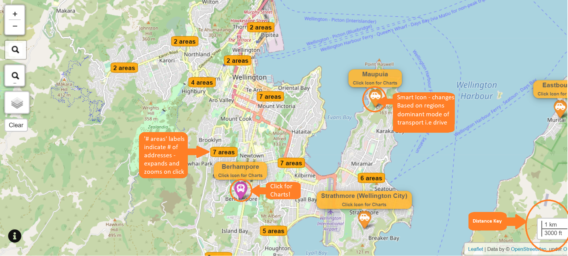
Scroll to zoom in or zoom out, and click on a label to explore a cluster. An icon shows which mode of transport is the most common in an area.
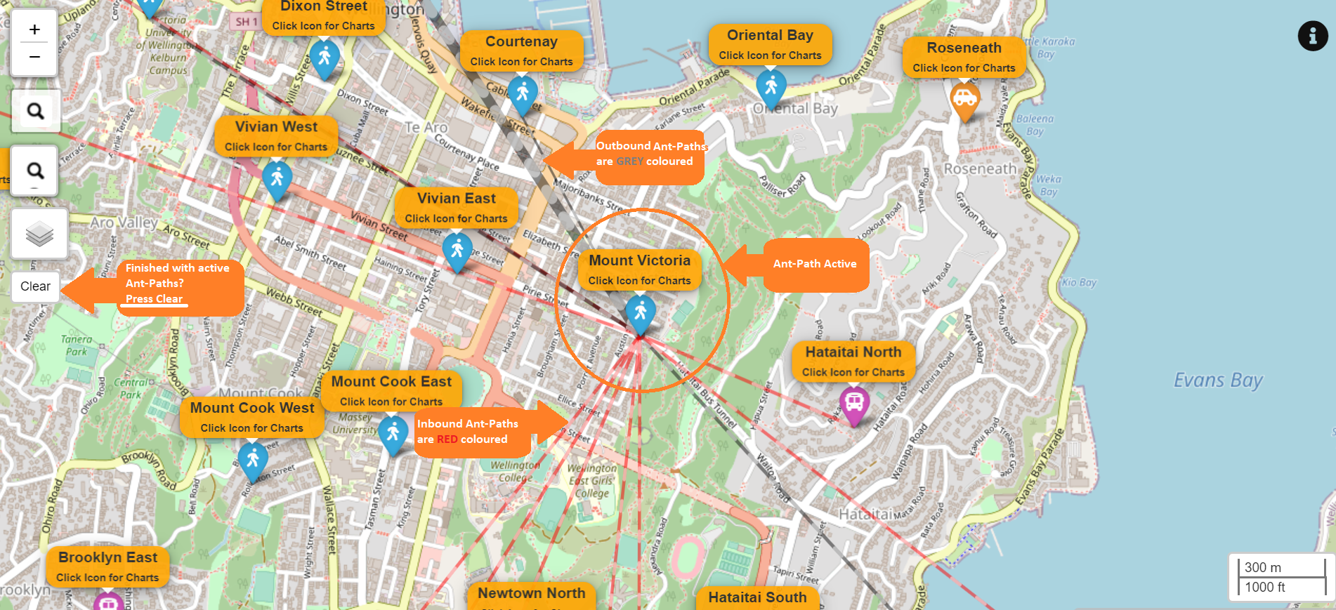
Click on a marker to visualise the modes of tranports and commuting flows of an area. Each path shows the to and from traffic flow of an area. Hover to reveal the home and destination address, distance, and number of commuters.
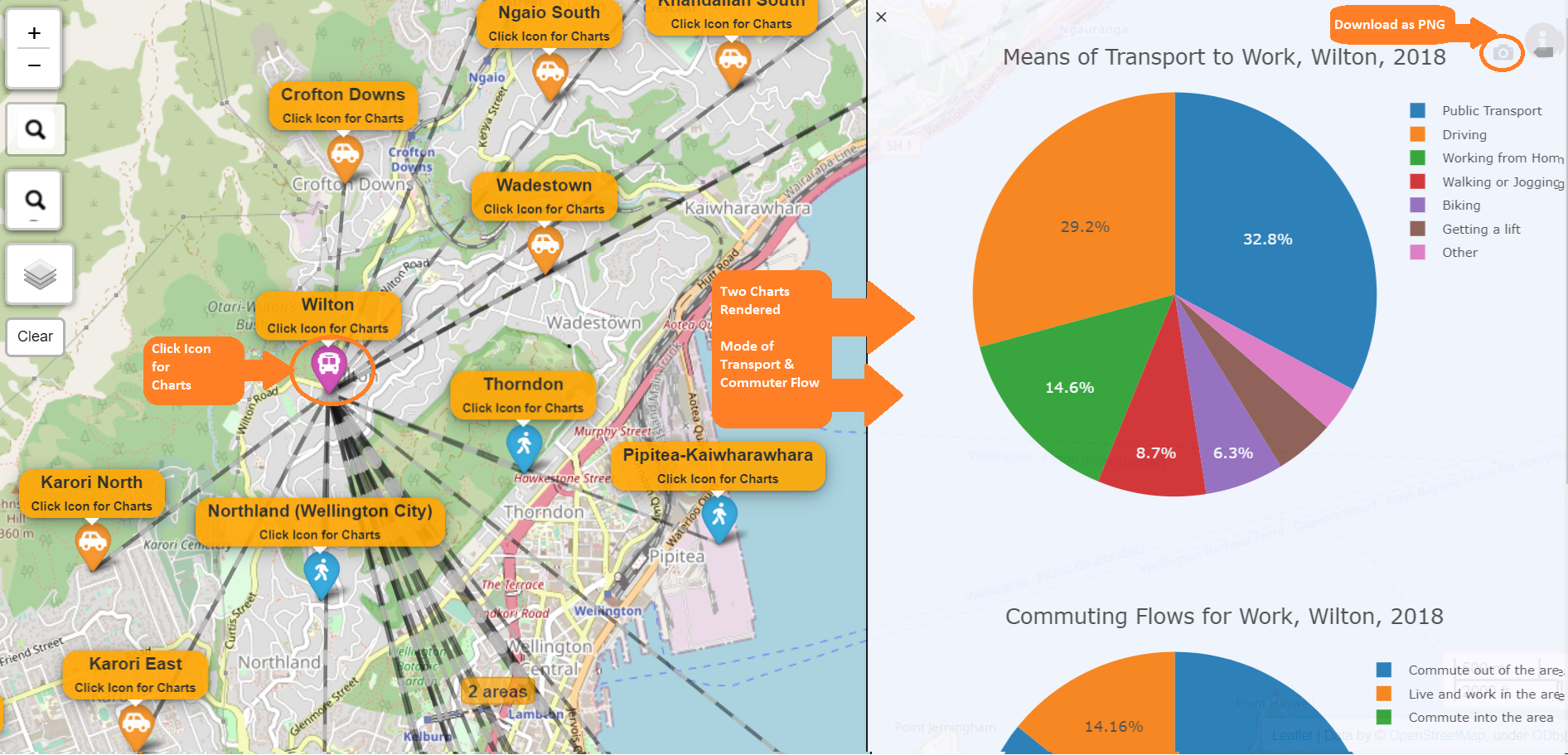
To save the pie charts, click on the top right of each chart.